Case Study
Overview
This project explored how to design a greeting card app that helps users remember important dates and send meaningful cards on time. The goal was to reduce last-minute stress while providing options for personalization, discretion, and reliable delivery.
.png)


Research
Competitive Analysis
I began with a heuristic-based evaluation of existing greeting card websites using Jakob Nielsen’s 10 Usability Heuristics.
Key findings included:
-
Cluttered navigation and confusing checkout flows
-
Limited personalization options
-
Few tools to help users remember dates or manage reminders
-
Inconsistent mobile experiences
These insights highlighted opportunities to improve discoverability, streamline purchasing, and add value through reminders and delivery options.
Persona
To ground the design in user needs, I developed a primary persona: Busy Ben, a 47-year-old VP of Finance. Ben often forgets occasions, struggles with last-minute card shopping, and values discreet, reliable solutions.

User Interview
"I missed Mother's Day last year because I was travelling"
I conducted recorded Zoom interviews to validate assumptions and uncover pain points.
Key insights:
-
Users often purchase cards last-minute, limiting their options.
-
Personal handwriting and messages remain important, even when ordering online.
-
Sustainability and charity cards were “nice to have,” but not decision drivers.
-
Delivery reliability and card quality were top priorities.
Journey Map
To deepen my understanding of the user experience, I created a journey map illustrating Busy Ben’s typical process of buying a greeting card—from the initial intention to the moment he gives it. By visualizing these touchpoints, I was able to identify opportunities to support Ben earlier in his journey—through timely reminders, a smoother browsing experience, and discreet delivery options. The journey map guided design priorities by emphasizing how thoughtful UX can turn a last-minute scramble into a calm, confident, and rewarding experience.


Ideation
Sketching & Brainstorming
I generated rough sketches to explore flows for reminders, browsing, and discreet checkout.
Task Analysis
I mapped out the steps a user would take—from receiving a reminder to selecting, personalizing, and buying a card—to identify friction points.
Design


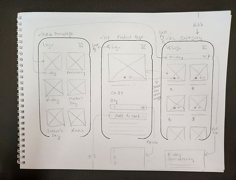
Paper Wireframes
I created paper wireframes to quickly test layouts and navigation options. These helped visualize the homepage, reminder dashboard, and card selection flow.
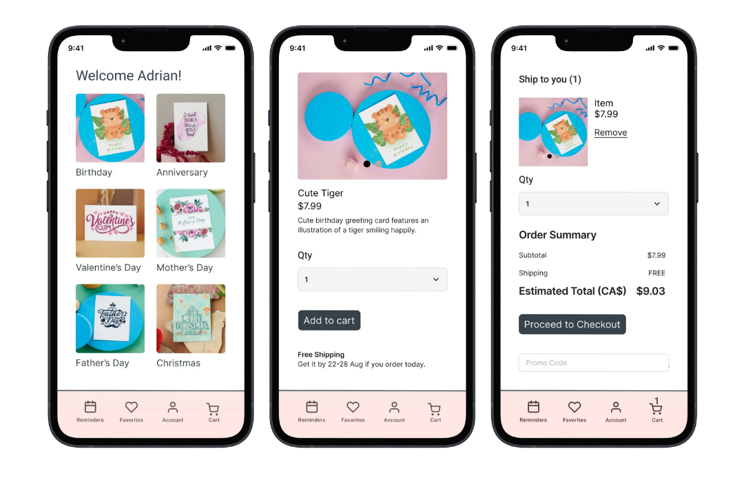
Low- and Mid-Fidelity Designs
Progressing from paper, I built digital mid-fi and hi-fi wireframes. These prototypes emphasized:
-
Reminder System: Simple prompts to add important dates.
-
Browsing Experience: Clean categories with filters for style, price, and recipient to be added at a later stage.
-
Discreet Delivery: Blind shipping packaging and pickup location options.

Reflection

This project showed me how users balance convenience with emotional impact when giving greeting cards. The research emphasized that while technology can streamline reminders and delivery, preserving personal touches is essential.
If developed further, the next steps would be usability testing with high-fi prototypes, iterating on the reminder interface, and validating discreet delivery options with real users.